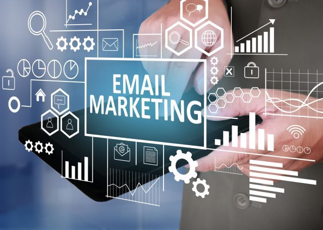
Email marketing is an extremely powerful tool for to connect with our customers and to build stables, long-term relationships. Nevertheless, with so many emails flooding our customers' inboxes every day, it becomes increasingly difficult to stand out from the crowd. That's where it comes in UX (user experience). By using UX in email marketing you have a very powerful paper in your hands.
You have the opportunity to make your client feel familiar and comfortable with you, happy to receive your email and of course to invest and buy your products or services.
Email Marketing is the channel that can bring you more sales of any other as it includes a warm audience. That is, an audience that already knows your business and what you offer and you have already created a point of contact. Why let this engaged audience and sales opportunity go untapped;
UX in email marketing is your ally!
What is UX in email marketing

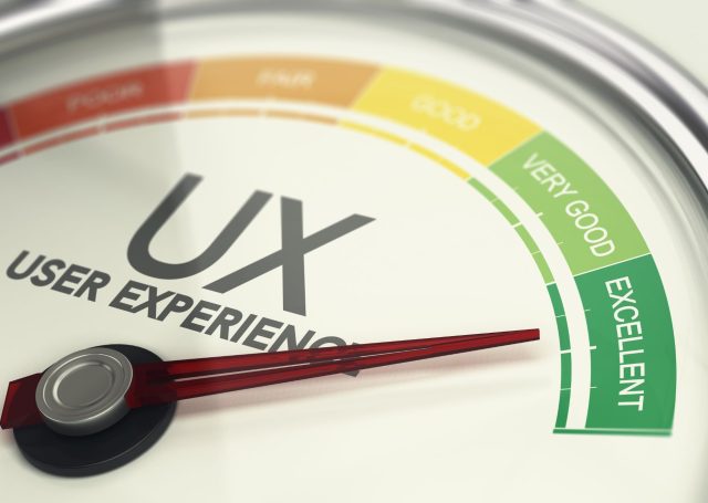
UX(User Experience) in email marketing or user experience refers to the overall experience a user has when opening an email(a site, an application etc.). From the planning and arrangement of the email until the content and call to action, each element plays a key role in whether the recipient will have a positive experience reading your email.
This is extremely important as a well designed email, which is easy to read and navigate, helps to building trust with your audience and enhances your brand image. A positive user experience leads to increased engagement and conversions, as your subscribers are more likely to take action when they have a clear picture of what you offer and how to take the next step.
From the other side, a bad user experience can lead to disappointment, confusion and, after all, registration From your email list. Prioritizing UX in Email Marketing not only improves the chances of opening and effectiveness of your email, But you also show your subscribers that you appreciate their time and attention.
In free translation this means greater connection to your customers, Customer conversion to loyal customers and more sales.
In this article we will talk about how you can use UX in your email marketing to strengthen it.
They follow 19 Optimal UX Design Practices in Email Marketing
1. Keep it simple: Use clean and minimal design
Here the rule applies as simple as better.
Imagine you have arranged to meet with a friend to talk to you about a problem facing. One is to go to the bustling bar in the square that is permanently crowded. The second case is to go to the corner quiet coffee. Which of the two are most likely to say better and leave without a headache; Probably the obvious answer is in the second. This is how it is with emails when they are 'overloaded'.
By removing clutter and distractions, User's attention can turn to the most important items, such as the message you want to communicate or urging for action. Simple designs also tend to they load faster and they are more affordable to users with slower internet connections or visual impairments. In addition, They are easy to read and can be read more comfortable even if the user is at work or somewhere with people.
2. Write a strong title shouting 'Click'
The title is one of the most important pieces In Email Marketing. Too many times is he who determines whether the recipient will open the email or not. So don't leave him to his luck. Everything starts from there! The time you have to draw the reader's attention is 2 seconds… Oh, Yes! As excellent as the content of your email is, If the reader does not click, he will never read that! Clearly and will not take any action whenever what we mentioned above will go on. Write a title that causes curiosity so that the recipient can open your email.
3. Create an interesting preview text
Preview text ή preview is the extra line shown next to the title. It is the next thing the reader is watching after the title. Preview Text should give the reader one Idea of what follows in an interesting and attractive way. Provides a preview of email content. What could motivate the recipient to open the email;
4. Make the recognizable
It is very important to signal that email comes from you. The basic features of your brand, As logo and colors play an important role in user experience. Your email recipients have already interacting with you, So they left you their email. So your logo and colors will cause feelings of intimacy. And that you want.
To improve this, Make sure you use your company name as a sender and a email with your domain(not gmail, Yahoo et al.). It is a strong element that gives professionalism. also, reassures your users that you are not spammer.
5. Highlight the benefits from the beginning
Suppose they opened your email. If in the first lines they do not find anything interesting or if they do not see anything that makes them stay, Most likely they will not waste time to read the remaining email. So., motivate readers you to stay. Highlight from the beginning What they will win if they stay and why they are interested in. Use storytelling and visual material to make it even more interesting.
6. Be summary and comprehensive
Let's go back to the example with the friend you came out to say. How is you more likely to watch what tells you; By putting elements that may not have a direct relationship with his problem and passing 5 hours without a conclusion or if it gets straight into the zoom; Clearly in the first case you might get bored of your life and wish there was pause. So in your email. The more information you put in an email, the more likely the user is to close it and to return to what he did. The summary, clear and To The Point Content, Only with the important information does it lead to the reader to be left to the end and move on to the next step you have set(Call toAction).
7. Make it readable
Use small paragraphs To make the email more readable and easy -to -read. Use dot to split the text and make it more scanned. Using also legible font and simple provisions Email design becomes more attractive visually and helps the user to understand the content. This clearly helps to create a positive experience that encourages users to deal with your email.
8. Leave white space
White space is the gap on the sidelines, between images, graphic design or text. White space is Unacceptable rule in design Either we are talking about email, either for a site, either for infographics, either for advertising. White space is extremely important. An email with adequate white space does not stun the eye, On the contrary it rests it. Allows him to observe the most important elements. also, makes the email enjoyable and legible and the message more clearly. On the contrary, 'Baboura' can disintegrate and lead to a bad user experience. As we said keep it Simple.
9. Create an impressive Banner in email
It's a very nice practice UX in Email Marketing. The banner is at the top of the email and is one of the best ways for increase the opening rates. May consist of the logo, the name, Even promotional offer.
10. Use a catchy call to action(CTA)
An attractive call to action (CTA) is a one well -guided message leading readers to take specific actions. These actions may be to get readers into your site, to contact you or even buy a product. That is why your CTAs must be tempting and visible Inside your email to increase customer dedication to your name and conversions.
Hick's Law proves that the time required to make a decision a user is directly proportional to the number and complexity of the options available. The same applies to a CTA. The many choices (CTA) will disassemble the reader and make it difficult for him to take some action. The rule says to include only one CTA or two at most, so that they are effective.
11. Insert interactive elements
The truth is that an email with a downloaded text might seem a little boring to you. But if this text were alternated with images, video and graphics would definitely be more interesting. So use in your emails and other elements besides text, so that you can do them more pleasant and attractive.
12. Optimize your images
Optimize images to ensure that they load quickly and don't slow down email. Time is precious and certainly no one wants to spend it waiting. Download the resolution of images and videos to "lighten" the email.
13. Use contrasting colors
Use contrasting colors for make important information stand out. We clearly don't mean use the entire rainbow palette! But it is necessary to put a different color on the points you want to emphasize such as e.g. on CTA buttons so they stand out.
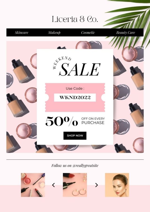
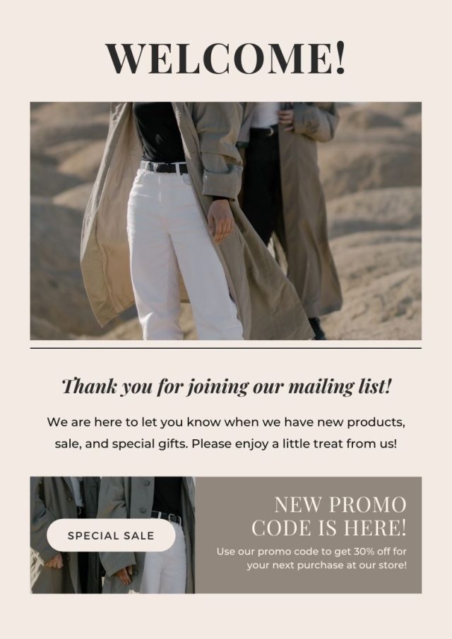
Email template from Canva
14. Use emojis
It might seem too radical to incorporate emoji into an email or newsletter. But it has proven to be one of the best email marketing design practices. Especially the use of emoji in subject line or in the preview text can to increase open rates. However, use appropriate emojis and only when necessary.
15. Make sure your email fits all screens
With over the 80% of users opening their email from their mobile phone you understand that it is necessary for email to adapt for all screens(mobile, tablet, computer).
Since it increases the ease with which a person reads an email, is undoubtedly one of the UX best practices in email marketing to enhance positive user experience and customer retention.
16. Put contact information
All fine and good, the user has reached the end of the email. But he has some questions or wants to contact you. How will it do that if it can't find your email or phone; Don't forget to include them. In this way, your recipients can contact you effortlessly if they have any questions or need additional information. In addition it shows that you are available to your customers and increases your credibility.
Once you have won the bet of awareness it is easier to turn it into trust in the face of your company.
17. Add the feature “Unsubscribe” at the bottom of the email
You might be thinking that the addition of “Unsubscribe” (unsubscribe from the list) it will undo all the hard work you put into creating the email. However, is far from the truth. Your subscribers' preferences change over time. They may at some point not find your content relevant and no longer wish to receive it. Adding a button “Unsubscribe” at the end, it means you care enough about your subscribers to let them go. It is highly positive element for a great user experience. You don't want people who are no longer interested in what you have to offer. also, is unethical don't give someone the right to choose whether they want to continue to be on your list or not.
18. Check that the links you put are working
It is vital that all links within your email match and point somewhere. A broken link leads to a poor user experience. If they don't work, not only does the user get nowhere but you also show a bad image. When users have easy and immediate access to the content they want, they trust you even more.
In addition, users should be able to easily find the information they are looking for. Therefore, all relevant data must be visible and clear and certainly comply with UX ethics(we do not want and should not lead to irrelevant content).
19. Create your email signature
Although people often underestimate this element, designing your signature has both professional and personal benefits. It shows professionalism but also that you are there for anything needed. It creates reliability and a sense of security. An email signature should include your name, your company name and contact details. You can even include your photo or logo and your social media links.
summarizing
Email marketing is the best medium for connect with customers and make them loyal followers. But because email to email differs, only by using UX in email marketing can you really make a difference and win over your customers even more. Follow the above tactics to make your emails attractive and greater sales tools.
Remember that your customers want useful, presentable and easily navigable content. Give them these elements and you will have created a great user experience.
Email template from Canva
Read also:
Combine UX And SEO And Get To The First Page Of Search Results
7 Tips For Attractive Newsletters That Your Audience Will Want To Read
Follow us on Facebook, LinkedIn and Instagram for even more tips regarding the online presence of your business. For what,what you need don't hesitate to contact us. Together we can organize the marketing strategy that will lead to an excellent user experience.